Booking page design: making a better first impression
The Yoya TeamSep 4, 20266 min read

Think about how many people see your booking page. Every prospect you follow up with. Every candidate. Every investor who asked for twenty minutes. For a lot of them it's the second thing they ever see from you, right after your email signature.
Now think about how much design attention it gets. Almost none. You picked a tool, uploaded an avatar, and never looked at the page again — because you never see it. You see the confirmation email. Your guests see the page.
We just rebuilt every screen of Yoya, and the booking page got the hardest look. This is what we changed, why, and the measurements that settled each argument. Take the parts that apply to whatever you use.
The job a booking page actually does
A booking page has one obvious job and one quiet one.
The obvious job is finding a time. Every tool on the market does this competently — that problem was solved a decade ago.
The quiet job is that it is a first impression you are not in the room for. Your guest is forming a view of how you work from a page you never look at. If it's slow, cramped on their phone, or visibly generic, that's the impression, and you don't get to explain it away.
Most booking page design advice stops at "add your logo and brand color." That's the least interesting lever available.
Start the conversation at the top
Here's a mistake we shipped and had to correct, because it's instructive.
Yoya's booking page is a conversation, so we built the chat the way a chat app does: messages pinned to the bottom of the frame, growing upward. The reasoning felt sound — one lonely message stranded in the middle of a tall card looks unfinished, so push it to the bottom where it reads as "the start of something."
On a laptop it was fine. On a phone, where the card is most of the screen, it was wrong. You'd scroll to the page and see a screenful of empty paper with a single sentence hiding at the bottom, just above the input. The first thing the page communicated was emptiness.
The fix is the boring one: start at the top and grow downward, and only pin to the bottom once the conversation is long enough to scroll. That's what every messaging app you use actually does. It looks obvious written down. It wasn't obvious while we were being clever about it.
If you're designing any interface with a variable amount of content in a fixed frame, the rule generalizes: align to the top when content is short, to the bottom when it overflows. Choosing one alignment for both states means you get one of them wrong.
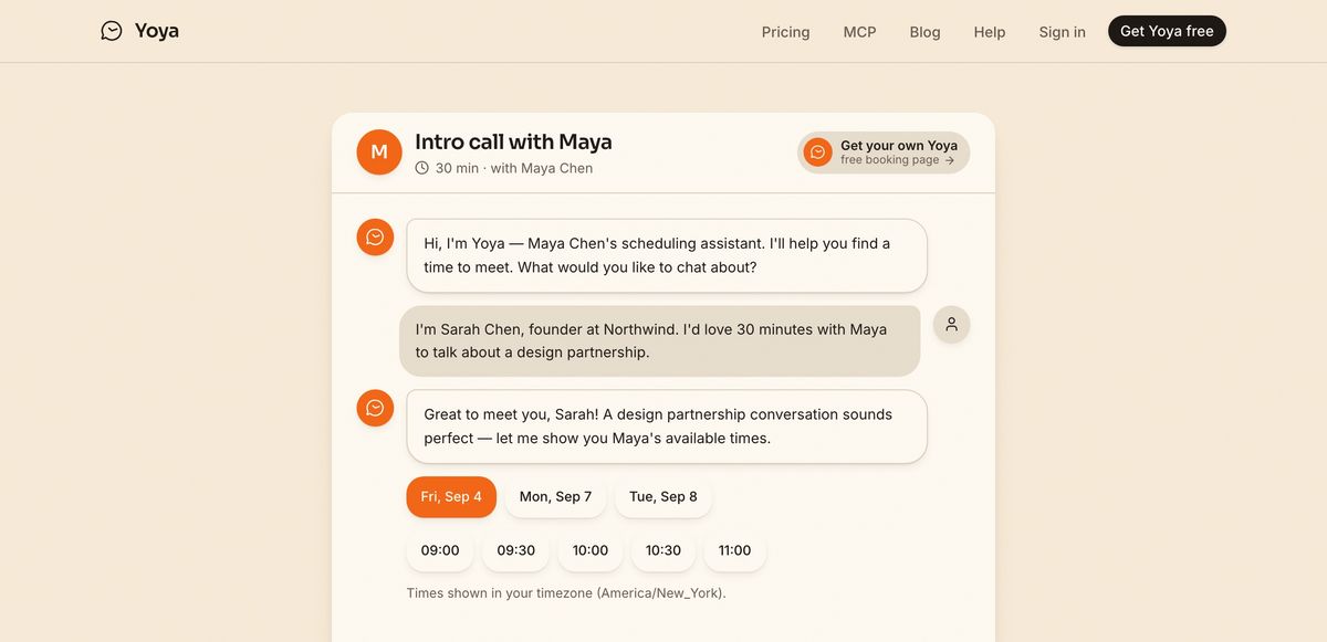
The Yoya booking page at the time of the redesign. Times are offered inside the conversation, in the guest's own timezone.
Two speakers need two sides
Both sides of the conversation used to sit down the left, distinguished only by the avatar and the shade of the bubble. It was tidy. It was also slower to read: to work out who said what, your eye had to check a small circle at the start of each line instead of just noticing which side of the page the text was on.
Left and right is a convention for a reason. It encodes the speaker in position, which you perceive without reading anything. The guest now sits on the right, the assistant on the left, and the cut corner of each bubble points back at whoever is talking.
This costs nothing and it's the single change that made the page feel most familiar to people seeing it for the first time.
It has to survive a phone
Here's the measurement that embarrassed us most.
Our signed-in dashboard bar laid out its contents in one row that refused to wrap. At 390 CSS pixels — an iPhone 15 — the row needed 498px and simply overflowed by 108px, dragging the whole page sideways with it. For an account with an upgrade button in the bar, the overflow was 174px. Even at 430px, the widest iPhone, it still ran 68px past the edge.
The result was a page you could scroll horizontally, with the wordmark pushed off the left edge and every card clipped. It had been that way for a while, because we develop on laptops.
Two lessons worth stealing:
- Test at 320, 360, 390 and 430, not just "mobile." The failure was invisible at 500px and above, which includes every breakpoint anyone thinks to check in a browser at half-width.
- A nav bar that can't fit should wrap or collapse, never clip. We now wrap to two rows below 640px and collapse the links into a menu below 768px, keeping only the one control worth pressing out on the bar. Checked at seven widths in two account states: nothing overflows at any of them.
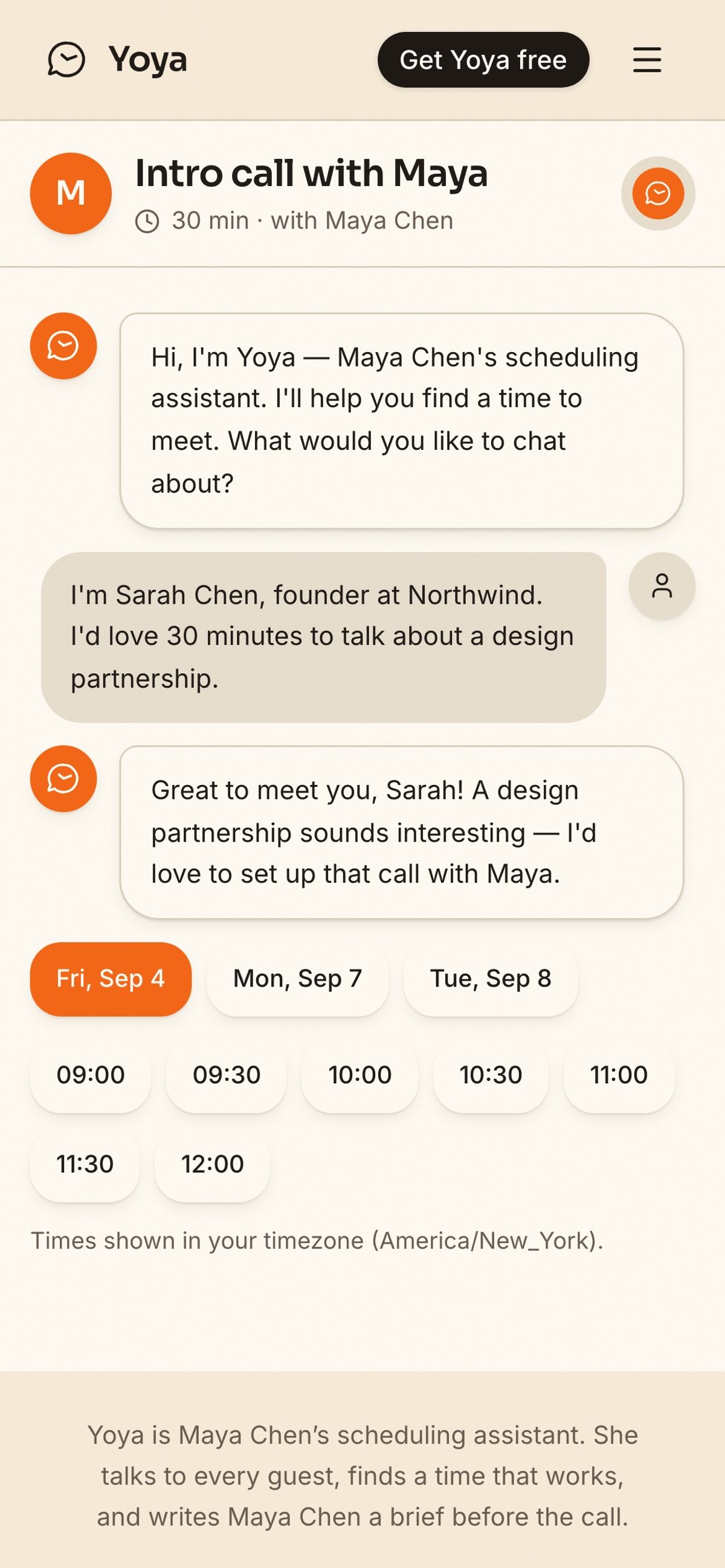
The same page at 390px. The bar keeps the wordmark and one action; everything else folds into the menu.
Ivory on ivory needs an edge
We built the whole product as paper: a warm cream board, ivory cards floating on it, charcoal ink, and a single orange accent spent on almost nothing.
That palette has one trap. The assistant's chat bubble was ivory, sitting on a card that was also ivory, separated only by a soft drop shadow. Because a drop shadow falls downward, the bottom edge of each bubble read clearly and the top edge dissolved into the background. Half a bubble is worse than no bubble; it reads as a rendering bug.
The fix was a one-pixel hairline border. Not a heavier shadow, not a different fill — an actual edge.
The general rule: a shadow is not an edge. If two surfaces share a color, a shadow will only ever define the sides the light isn't coming from. When contrast between surfaces is low by design, draw the boundary explicitly.
Nothing should move while someone is reading
Layout that shifts under the reader is the most-felt and least-discussed quality problem on the web. Google measures it as Cumulative Layout Shift, and a booking page is unusually prone to it: content streams in, numbers animate, fonts swap, message bubbles appear.
We got the homepage from 0.033 to 0.0001 with four unglamorous changes:
| Cause of the shift | Fix |
|---|---|
| Chat window growing as messages arrive | Give the window a definite height instead of a minimum |
| A counter animating 0 to 100 and gaining a digit | Reserve the width of the final figure in ch units |
| Bubbles pushing each other down the page | Move them with transforms, not layout |
| Web font swapping in after first paint | Preload the fonts used above the fold |
None of that is clever. All of it is invisible when done and obvious when skipped.
Spend your accent color on almost nothing
The most common failure in booking page design is a brand color applied everywhere: colored header, colored buttons, colored time slots, colored footer. It reads as a template with a paint bucket applied, which is exactly what it is.
We use one orange. It appears on the selected time, the send button, the host's avatar, and the day currently being shown. That's close to the whole list. Everything else is ink on paper.
The restraint is the point: if everything is emphasized, the selected time doesn't stand out — and the selected time is the only thing on the page that matters.
A checklist for your own booking page
Whatever tool you use, these are worth ten minutes:
- Open your own link on your phone, on cellular, as a guest — not as yourself, logged in. Most people have never done this.
- Check for horizontal scroll at the narrow end. If the page slides sideways, something in your header doesn't fit.
- Count your accent color. If it appears more than four or five times, it has stopped meaning anything.
- Watch what moves in the first two seconds after load. Anything that jumps is costing you both attention and search ranking.
- Read the first sentence a guest sees. Is it doing any work, or is it your name and a duration?
- Ask what the page tells you after someone books. If the answer is "a name, an email and a time," your booking page is only doing the obvious half of its job.
That last one is the difference we care most about. Choosing a time is one part of preparing for a meeting. A booking page that holds a conversation can hand you the time and what the meeting is about, who's coming, and what they want — written up before you walk in.
If you want to see the current version rather than read about it, talk to Yoya the way a guest would. It's the same page this article is about, and it's free to set up your own.